Charters Towers
Charters Towers
Charters Towers is a Marketing Eye portfolio project focused on logo rebrand, marketing collateral, signage and destination promotion. Charters Towers is a town within the Charters Towers Region in northern Queensland, Australia.
As a regional town, Charters Towers needed branding that could help communicate what the destination offers to both tourists and residents. Strong destination branding is important because it helps create a clear identity, supports local recognition and makes it easier to promote the town’s appeal.
Marketing Eye worked with Charters Towers to create a complete rebrand. The project included logo development, collateral and signage designed to support a stronger and more consistent identity for the city. These marketing elements helped present Charters Towers in a more professional and unified way.
Charters Towers Rebrand
The logo rebrand helped give Charters Towers a refreshed visual identity. A strong logo is important for a town or destination because it can be used across different promotional materials, signage and community communication.
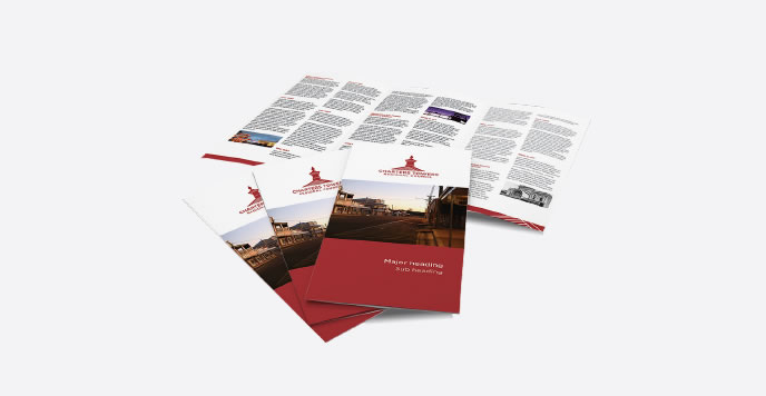
Marketing Eye also created collateral for Charters Towers. These materials helped support communication about the town and provided professional assets that could be used to promote the destination to different audiences.
In addition to the logo and collateral, Marketing Eye developed signage for Charters Towers. Signage plays an important role in destination promotion because it helps create visibility, recognition and a stronger sense of place for tourists and residents.
The Charters Towers project shows how strategic marketing can support a regional destination through logo rebrand, collateral and signage. Through this work, Marketing Eye helped Charters Towers promote what the town can offer to tourists and residents while supporting a more consistent city brand identity.


Related Projects