The Psychology Of Color In Marketing And How it Can Help You
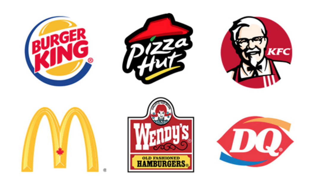
Take a minute and think about your favorite fast food restaurant, what is the main color that takes up their branding?
If you said red, you are not alone.
Red – According to most studies, red encourages an appetite, as well as being associated with stimulation, excitement, and activity. Because of this, it is used by a lot of fast food chains: McDonalds, KFC, Pizza Hut, Wendy’s, DQ and food applications: Grubhub, Tomato, Yelp. However, one can beg to differ that the color red has just become synonymous with the fast food industry as a whole because of how red has been marketed. If you are looking for a color for your fast food company or food app, integrating red is definitely recommended!
Culturally:
North America – Energy, excitement, action
South America – Passion, sacrifice, love
China – Heroic, used for festive occasions, vitality, happiness
India – Love, fertility, sign for married women
Africa – Color of mourning
Middle East – Sacrifice, sin
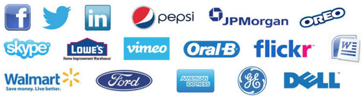
Blue – While red increases appetite, blue is said to deter people from eating. The color of skies, the beautiful clear waters of the Caribbean evokes a calmness. Blue is also a color that is preferred by men, provides a sense of security and stimulates productivity. Many brands that want to promote trust in their brand opt for this color choice. Such as brands that are in the health industry, financial brands, social media and service companies just to name a few.
Culturally:
North America – Trust, authority, conservative, peace and calm, masculine
South America – Holiness, color of soap
China – Immortality, feminine
India – Religious color
Africa – Positivity, happiness
Middle East – Protection
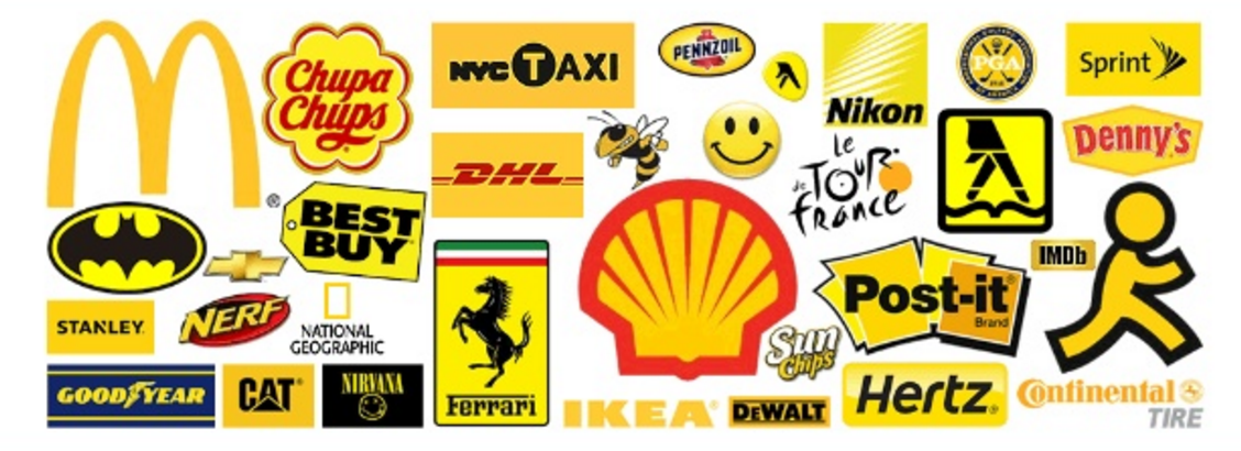
Yellow – Oh yellow, such a love hate relationship with this color. On one spectrum, Coldplay wrote a song about it, a girl that reminded him of all the beautiful things that are yellow. And on the other, it has a disturbing reaction on babies to the point where it makes them cry. Brands that usually choose yellow to represent them are companies that want to represent playfulness, creativity, or companies that want an attention getting color. Such as companies geared towards kids products. However, most companies that do choose to use yellow do not use it alone and need another color to either border it or accompany it. Too much yellow can be disrupting to consumers and cause anxiety.
Culturally:
North America – Happiness, joy, caution
South America – Happiness, warmth
China – Sacred, honor, masculine color, pornography
India – Sacred, symbol of a merchant
Africa – Usually reserved for people of high ranking
Middle East – Happiness, prosperity
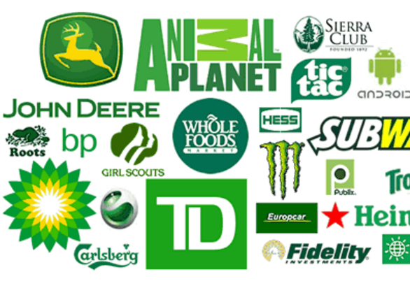
Green – The luck of the Irish ring any bells? Green for most is the color of good fortune, health, and prosperity. Most brands like Whole Foods, and many other health conscious stores tend to veer towards this color to portray themselves as a brand you can trust to have good healthy options. Other companies that tend to use green are companies that wish to portray stability and wish to showcase that they are environmentally friendly. For example, a lot of new car models that have the “eco” mode are represented by some sort of green icon.
Culturally:
North America – Lucky, spring, new birth, nature, environmental awareness
South America – Death
China – Fertility, regeneration, hope
India – Hope, harvest
Africa – Corruption, drug culture
Middle East – Wealth, prestige
Lastest Posts


