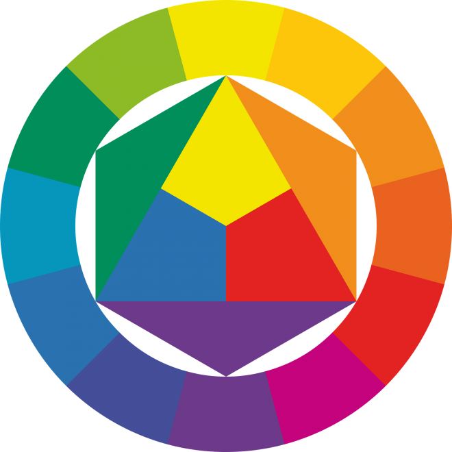
Color Theory in Branding
With increasingly minimalist design becoming more popular in this post-modernist era, visual branding has a shrinking range of tools to use to convey a message. One that remains unwaveringly relevant is the use of color theory in design. According to research conducted by The Institute for Color Research, people make subconscious judgments about a product within just 90 seconds of initial viewing, and between 62-90% of that assessment is based on color alone. Its use as a tool for expressing meaning to audiences is undeniable, but how best to go about it?
INDIVIDUAL COLORS
Each color has distinct feelings associated with the sight of it. Even just temperature of colors are reminiscent of certain moods, with warmer tones evoking a sense of strength and excitement, while cooler ones usually feel calmer and more stable. Tubik Studio briefly describes each color as having the following associations:
Red. Confidence, youth, and power.
Orange. Friendly, warm, and energetic.
Yellow. Happiness, optimism, and warmth.
Green. Peace, growth, and health.
Blue. Trust, security, and stability.
Purple. Luxurious, creative, and wise.
Black. Reliable, sophisticated, and experienced.
White. Simple, calm, and clean.
HUES AND TONES
Hues are the color families you decide to use in your branding, and tones are how saturated they are. Often different tones are necessary to create depth and dimension, or you risk everything looking underwhelmingly flat. Color families can be combined to create various effects. High contrast in colors should be reserved for more important aspects of your design, since too much can be aggressive so it is best used in moderation. Too many different colors clashing can also lead to an overwhelming effect, so combinations of only a few distinct colors works well in most cases.
COMPLEMENTARY COLORS
Since they lie completely across from each other on the color wheel, complementary colors share no overlap in base colors. Due to this, they have high contrast, but mixing their shades into one can neutralize both colors. Their inherent contrast leads to emphasis of any complementary colors present, making them very eye-catching to viewers.
ANALOGOUS COLORS
These are colors next to each other on the color wheel, often connected via a tertiary color. Using these can create a cohesive color palette for a website or logo while still entertaining more contrast than a completely monochromatic color scheme. This color scheme is more subtle than others, and therefore lends itself to being applicable in a wide variety of scenarios.
TRIADIC COLORS
Although choosing triadic colors can lead to relatively high contrast, even spacing between the colors along the color wheel leads to them balancing each other out. Triadic colors work well as accent colors or with lowered saturation when combined. Making one color the main color while the others recede can emphasize and draw the eye to specific components of your website or logo.
Although choosing colors to use in design may seem simple, due to the sheer amount of combinations attainable, the possibilities are nearly endless. Knowing which to use requires consideration of both your audience and specific ideas you want to showcase about your brand. Notice color palettes that brands have implemented in their campaigns to start building an eye for visually balancing colors!


Leave a comment
Make sure you enter all the required information, indicated by an asterisk (*). HTML code is not allowed.
comment ( 1 )
Léo
18 Feb 2019Colour is undoubtedly the most difficult area to manage in a visual identity or packaging because it is indeed subject to infinite subjective but also cultural notions. A colour, yes, but also its association with other colours!
ReplyLet's not forget that "if it's beautiful, it will sell! ».